Studio Act of Kindness has converted a 3-Storey house into a retail store through the use of color that was not only inspired by the brand’s identity but was also influenced by color psychology
Text: Kullaphut Seneevong Na Ayudhaya
Photo Courtesy of Studio Act of Kindness, SHOP BOLD and Artit Wongpradu except as noted
ในยุคสมัยที่โลกในชีวิตจริงผสานเข้ากับโลกออนไลน์ กิจกรรมที่เกิดขึ้นในโลกออนไลน์เคลื่อนผ่านเข้ามาสู่โลกความจริง เช่นเดียวกันกับที่โลกความจริงค่อยๆหลอมรวมกับโลกออนไลน์ทีละน้อยและกำลังแนบชิดกลายเป็นเนื้อเดียวกัน สิ่งเหล่านี้ส่งผลต่องานออกแบบทางสถาปัตยกรรมไม่ต่างกัน โดยเฉพาะเมื่อกิจกรรมทางเศรษฐกิจที่เกิดและเติบโตขึ้นในแพลตฟอร์มออนไลน์อย่างก้าวกระโดดในห้วงศตวรรษที่ผ่านมา ได้ขยับเข้ามาปรากฏเป็นพื้นที่ทางกายภาพ ดังเช่นในกรณีของโครงการออกแบบร้าน ‘BOLD’ จากการปรับปรุงบ้านเก่าสามชั้น ในซอยสุขุมวิท 49 โดยคุณชารีฟ ลอนา จาก Studio Act of Kindness ให้กลายเป็นพื้นที่หน้าร้านที่ต้องการสะท้อนถึงตัวตนและอัตลักษณ์ของแบรนด์
จุดเริ่มต้นของการออกแบบเกิดขึ้นจากโจทย์ใหญ่ที่สำคัญคือการปรับภาพลักษณ์องค์กร (Rebranding Corporate Identity) จากเดิมที่เป็นแบรนด์ขายสินค้าแฟชั่นผู้หญิง ระดับ Hi-end ในพื้นที่ออนไลน์ ก่อนจะปรับมาใช้ชื่อแบรนด์ใหม่ด้วยคำว่า ‘BOLD’ ที่หมายถึงการขับเน้น การสร้างความแตกต่าง และสร้างจุดสนใจ ผ่านการผลิตผลงานกับนักออกแบบผลิตภัณฑ์รุ่นใหม่ ทีมผู้ออกแบบจึงเฟ้นหาทำเลที่เหมาะสมในการเป็นพื้นที่สำคัญที่สร้างประสบการณ์ระหว่างลูกค้าที่เคยซื้อผลิตภัณฑ์และกลุ่มลูกค้าใหม่ที่เข้ามาเยี่ยมชมหน้าร้านจริง ด้วยทำเลซอยสุขุมวิท 49 ที่วางตัวขนานไปกับซอยทองหล่อ (สุขุมวิท 55) ในย่านใจกลางพื้นที่พาณิชยกรรมที่มีความสำคัญ และรายล้อมไปด้วยองค์ประกอบสำคัญของเมือง ไม่ว่าจะเป็น สถานศึกษา โรงพยาบาล โรงแรม สำนักงาน คอนโดมิเนียม หอศิลป์ บาร์ และย่านพักอาศัยของชาวต่างชาติ องค์ประกอบเหล่านี้ต่างส่งเสริมให้พื้นที่ดังกล่าวเป็นทำเลที่แบรนด์มองว่าเหมาะสมต่อการเป็นสาขาเรือธง (Flagship Store) ของแบรนด์
เมื่อออกแบบปรับปรุงบ้านเก่า ผู้ออกแบบจึงให้ความสำคัญต่อการสร้างประสบการณ์แห่งการซื้อสินค้าแบบใหม่ ต่างจากโดยทั่วไปที่มีพื้นที่ทางเดินและชั้นวางสินค้าแบบเก่า ให้พื้นที่จัดแสดงสินค้ากลายมาเป็นพื้นที่จัดแสดงงานศิลปะ คล้ายกับหอศิลป์ที่ขับเน้นผลงานออกแบบของนักออกแบบ สร้างประสบการณ์ระหว่างพื้นที่ต่อผู้ใช้สอยให้เกิดปฏิสัมพันธ์ระหว่างตนเองกับผลิตภัณฑ์ ลูกค้าจะค่อยๆค้นพบตัวเองผ่านการเดินพินิจพิจารณาอย่างถี่ถ้วนต่อผลิตภัณฑ์ในแต่ละชิ้น ซึ่งเป็นสิ่งที่สำคัญที่ผู้ออกแบบมองว่าไม่สามารถเกิดขึ้นกับการเลือกซื้อสินค้าจากโลกออนไลน์ในปัจจุบัน ในขณะเดียวกันลูกค้าจำเป็นจะต้องได้รับสุนทรียภาพในด้านความเป็นส่วนตัวระหว่างการเลือกสินค้าไปพร้อมกัน จึงเป็นโจทย์ที่มีความสำคัญและท้าทายต่อการออกแบบ เนื่องจากความเป็นส่วนตัวระหว่างตัวผู้ใช้กับผลิตภัณฑ์ของแบรนด์มีความสำคัญ และเป็นหัวใจหลักปัจจัยหนึ่งของการออกแบบพื้นที่ร้านในยุคใหม่
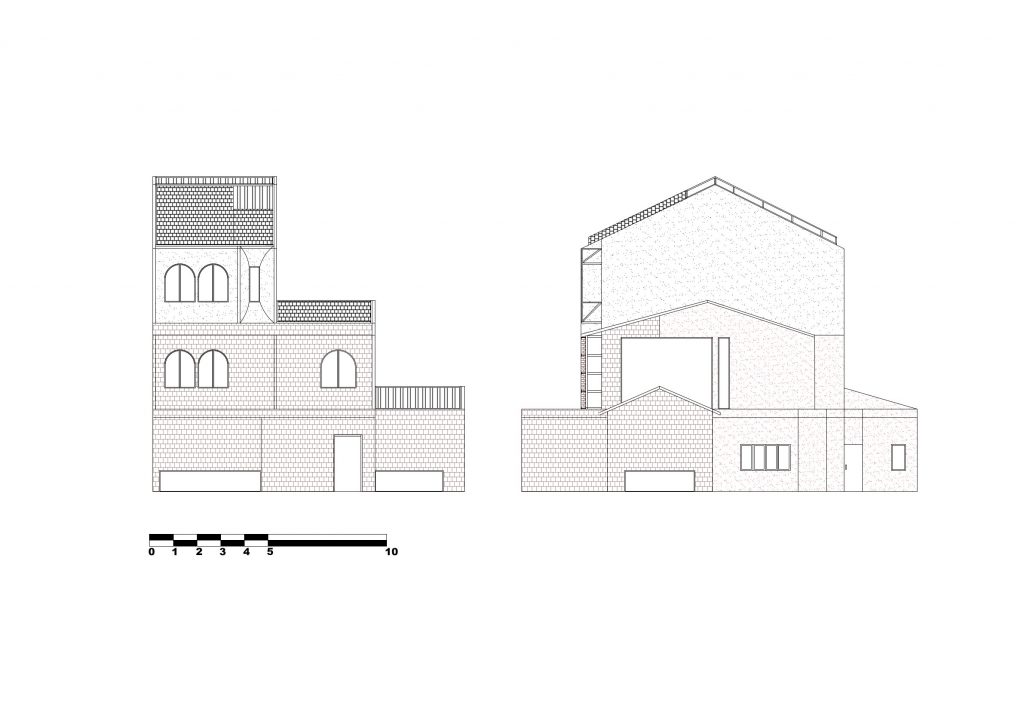
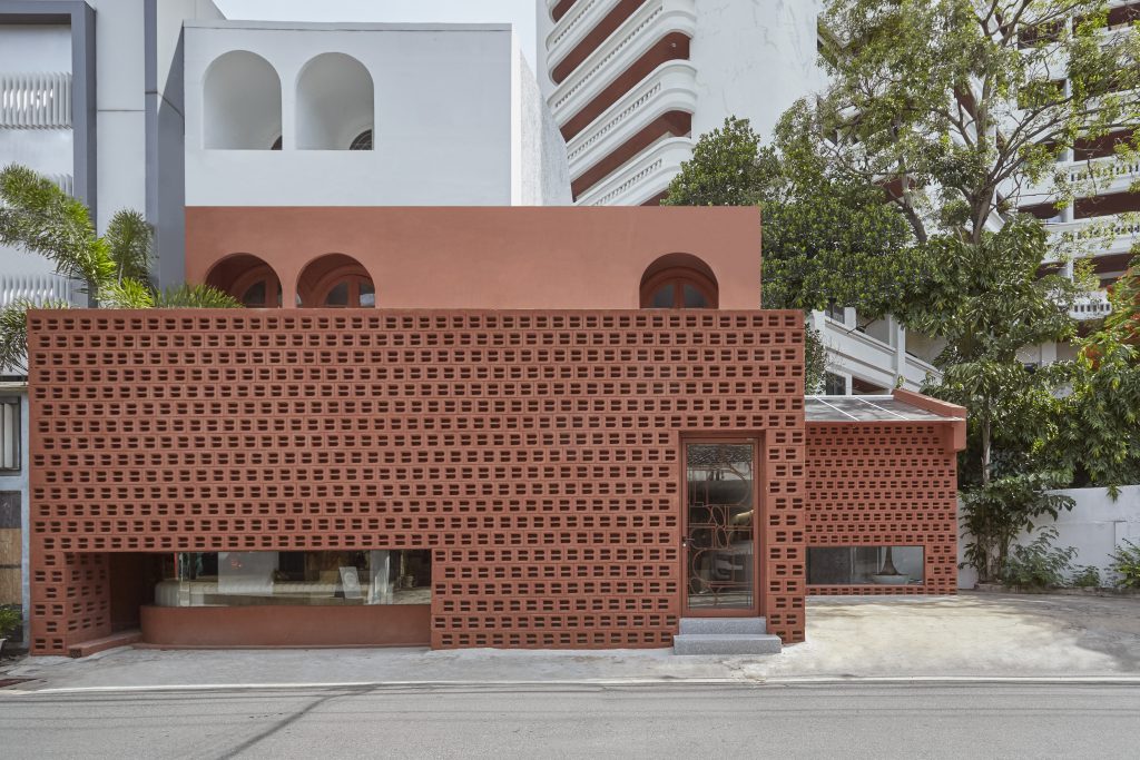
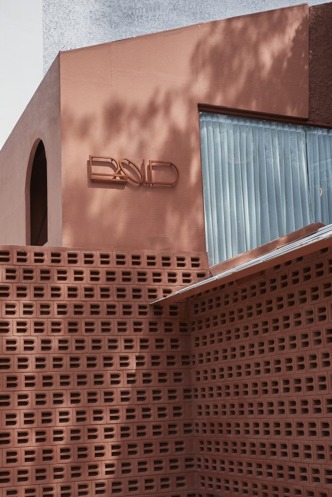
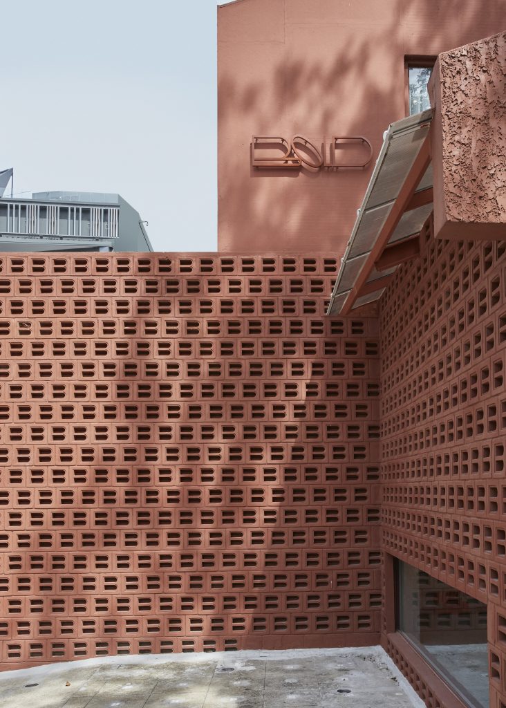
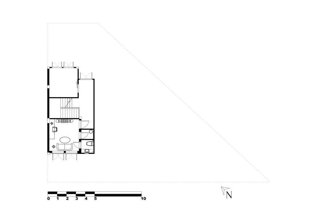
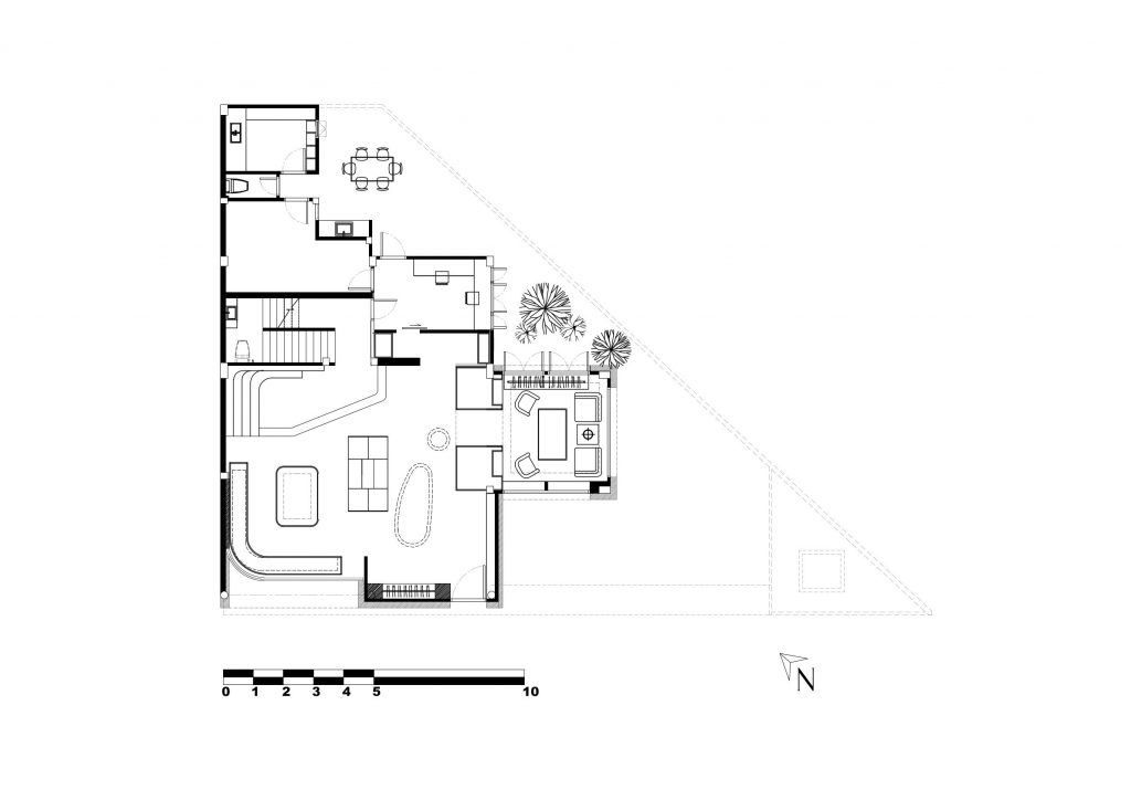
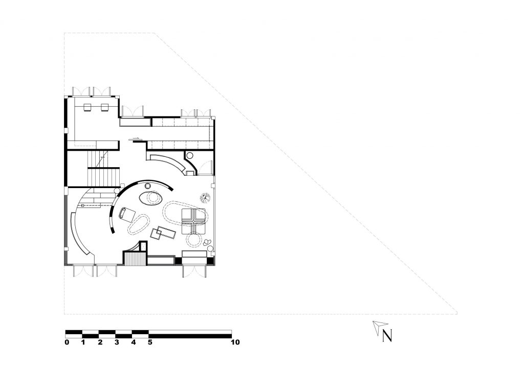
จากความตั้งใจของผู้ออกแบบในการสะท้อนอัตลักษณ์ของแบรนด์ผ่านด้วยตัวอักษรและสี ผนังภายนอกของตัวอาคารจึงถูกก่อขึ้นด้วยอิฐสีแดง ที่สั่งหลอมและเผาจากโรงงานโดยเฉพาะ เป็นอิฐที่มีรูปแบบตัวอักษร ‘B’ ซึ่งเป็นตัวย่อของคำว่า ‘BOLD’ จำนวน 500 บล็อค แนวอิฐสีแดงเลือดหมูนี้ถูกก่อล้อมผนังชั้นแรกเกือบทั้งอาคาร โดยผนังชั้นสองเป็นผนังปูนที่ถูกทาสีให้กลมกลืนกับสีวัสดุอิฐ ส่วนชั้นสามถูกทาด้วยสีขาวที่แสดงออกชัดเจนว่าแยกการใช้งานกัน แนวอิฐนี้ช่วยสร้างคุณลักษณะของความเป็นพื้นที่กึ่งปิดล้อมไปพร้อมกับคุณสมบัติของการระบายอากาศ นอกจากแนวของอิฐดังกล่าวยังมีการเจาะช่องเปิด เป็นแนวกระจกบริเวณระดับใกล้พื้นดิน เพื่อสร้างช่องเปิดรับแสงให้กับส่วนพื้นที่ภายในอาคารไปพร้อมกับการสร้างมิติความเชื่อมโยงระหว่างพื้นที่กับพื้นที่ภายใน ด้วยแนวอิฐสีแดงและช่องเปิดดังกล่าว ช่วยสร้างความดึงดูดและแฝงเร้นถึงความน่าค้นหา ความเย้ายวนใจที่เชื้อเชิญให้คนเข้ามาสัมผัสไปพร้อมกัน บริเวณประตูทางเข้าถูกออกแบบให้ชื่อของแบรนด์ ‘BOLD’ จัดเรียงผ่านคิ้วและลวดลายของประตูคล้ายศิลปะอิทธิพล Art deco เรียงตัวอักษรล้อไปกับกรอบของบานประตู โดยอาคารถูกแบ่งออกเป็น 3 ชั้น ชั้นแรกถูกออกแบบให้เป็นพื้นที่สำหรับการจัดแสดงงานใหม่ (New Arrival) ของนักออกแบบแฟชั่นตามแต่ละฤดูกาล ชั้นที่สองคือส่วนของ Casual Catalogue Product เป็นส่วนจัดแสดงสินค้าที่แบรนด์มี และชั้นที่สามคือส่วนสำนักงาน Office Gallery
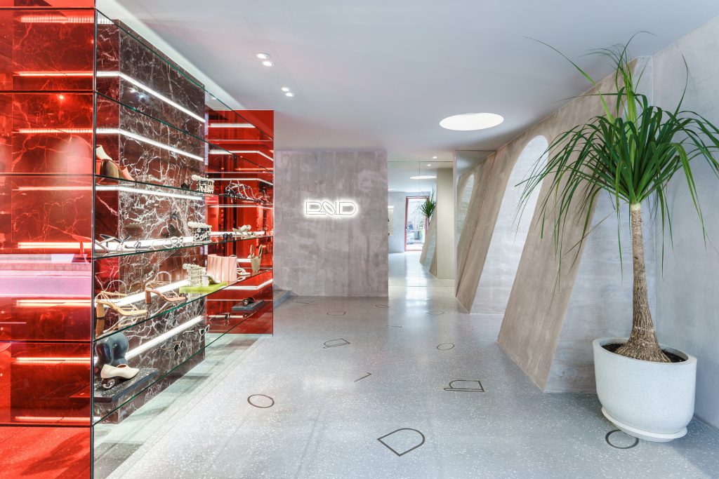
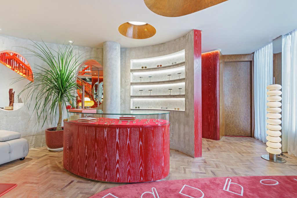
เมื่อเข้าสู่พื้นที่ภายในผู้ออกแบบยังคงนำเอาอัตลักษณ์ของแบรนด์ใส่เข้ามาในทุกองค์ประกอบของอาคาร ไม่ว่าจะเป็นบริเวณพื้นที่ใช้เทคนิคพื้นขัดฝังตัวอักษร 4 ตัว B-O-L-D ลงไปวางตัวกระจัดกระจายอยู่บนพื้นโถงทางเข้า ส่วนพื้นที่จัดแสดงสินค้าผู้ออกแบบเลือกใช้วัสดุหลายชนิดแต่ขับเน้นสีสันฉูดฉาดของสีแดงให้โดดเด่นขึ้นมา เช่น การใช้กระจกเงา กระจกสีแดง การใช้ไม้แต่ทาสีแดงสด การใช้พรมสีแดงที่ตัดเข้ากับพื้นไม้ปาเก้ และไม่ลืมที่จะเลือกใช้ตัวอักษร 4 ตัวลงไปกับพรม
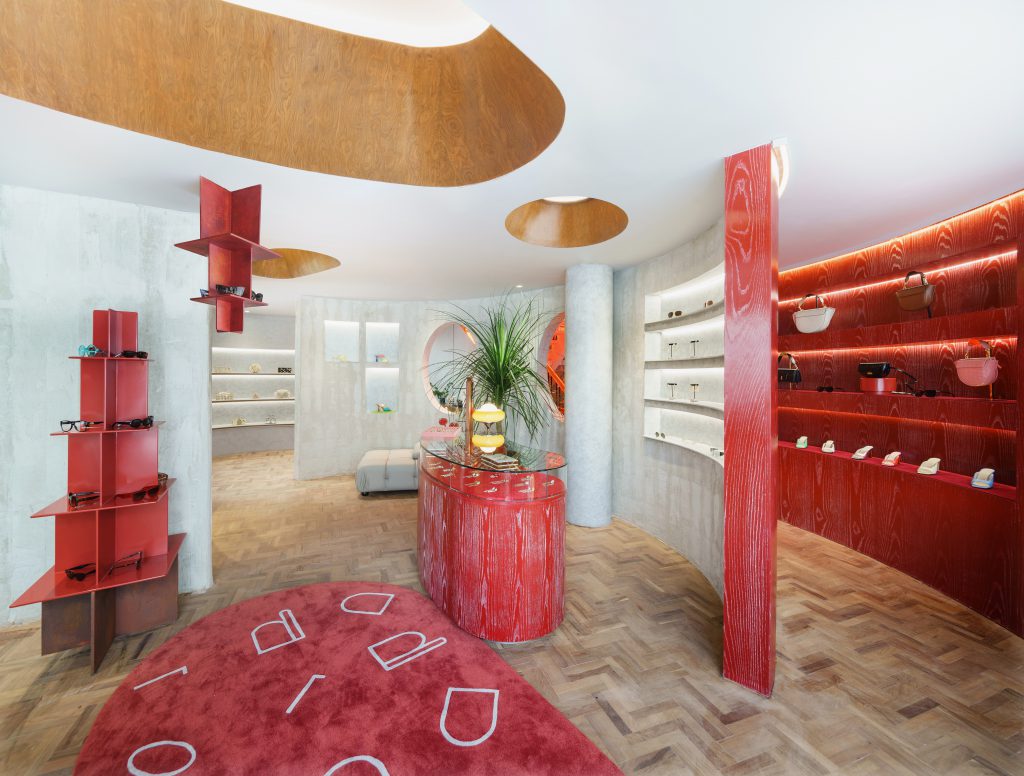
เทคนิคการใส่อัตลักษณ์ของแบรนด์ถูกคัดสรรลงไปในทุกรายละเอียดนี้ผู้ออกแบบตั้งใจให้เกิดการจดจำต่อผู้ใช้งานอาคาร ให้ทุกๆพรมแดนภายใต้พื้นที่ของร้านค้านี้ทำหน้าที่สร้างบทสนทนาและสร้างประสบการณ์ที่มีต่อแบรนด์ การสร้างประสบการณ์ในมิติที่แตกต่าง วัสดุที่ไม่เหมือนกัน รวมไปจนถึงองค์ประกอบที่แตกต่างกัน เป็นความท้าทายที่ผู้ออกแบบพยายามสร้างให้เกิดประสบการณ์ต่อแบรนด์ ในส่วนนี้ผู้ออกแบบมองว่าเป็นความพยายามหาจุดสมดุลระหว่างสิ่งเก่ากับสิ่งใหม่ การเลือกใช้สีแดงนอกจากเกี่ยวข้องกับอัตลักษณ์ของแบรนด์แล้วยังมีผลในเชิงจิตวิทยาของสี ที่ทำให้ผู้ออกแบบหยิบมาใช้พัฒนาสร้างจุดสนใจให้กับพื้นที่ว่าง ผ่านการใช้ช่องเปิดที่อนุญาตให้แสงเข้ามาสัมผัสกับสีแดงของแบรนด์ หรือการทาสีขาวให้กับฟ้าและสีเทาของผนังที่ตัดกับวัสดุอลูมิเนียมของชั้นวางก็ช่วยขับเน้นความพิเศษของผลิตภัณฑ์ได้เป็นอย่างดี
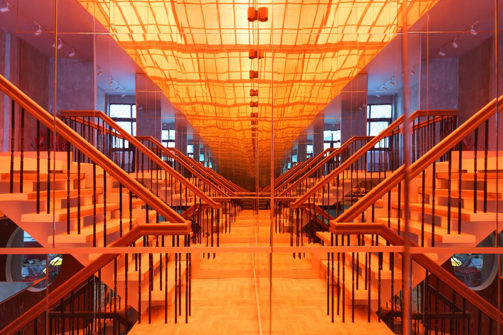
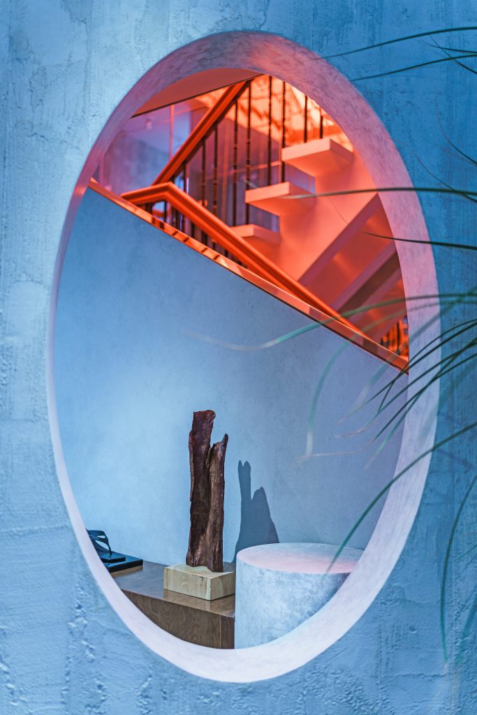
เนื่องด้วยเป็นโครงการออกแบบปรับปรุงจากอาคาร ที่มีการใส่องค์ประกอบของการประดับตกแต่งใหม่เข้าไปในพื้นที่เก่า จึงส่งผลให้เกิดพื้นที่และการแสดงออกทางสถาปัตยกรรมในมิติที่แตกต่างกันไป เช่น การกรุแนวผนังกระจกสีแดงบริเวณบันไดเชื่อมระหว่างชั้น ซึ่งแนวกระจกนี้ได้สะท้อนตัวพื้นที่ทางเดินไปพร้อมกันกับการสะท้อนแสงที่ผู้ออกแบบอนุญาตให้ตกกระทบจากช่องแสงด้านบนของอาคาร และแสงที่ตกกระทบจะมีสีในเฉดสีแดงซึ่งเป็นสีอัตลักษณ์ของแบรนด์ คุณลักษณะเชิงพื้นที่แบบนี้ก่อให้เกิดการสะท้อนกลับไปกับมาระหว่าง ตัวตน อัตลักษณ์ สิ่งเก่าและสิ่งใหม่ ไม่ต่างอะไรกับงานออกแบบแฟชั่นที่จำเป็นต้องหยิบยืมคุณค่าเชิงวัฒนธรรมในอดีตมาผสานร่วมกับความคิดสร้างสรรค์ใหม่จากนักออกแบบ ซึ่งเป็นความมุ่งหมายสำคัญของนักออกแบบที่พยายามสร้างคุณลักษณะเชิงพื้นที่แบบนี้ให้กับแบรนด์ ที่ต้องการสร้างประสบการณ์ความสัมพันธ์ระหว่างออนไลน์สู่ออฟไลน์ ให้กับกลุ่มลูกค้าของแบรนด์ อีกทั้งการสร้างประสบการณ์แบบกึ่งส่วนตัวยังเป็นสิ่งที่มีความสำคัญและเป็นความท้าทายต่อนักออกแบบมากขึ้นในอนาคต
In an era when the real world is increasingly merging with the online world, where activities born online are migrating into the physical world, little by little, these two worlds are converging into one seamless whole. The impact, even on architecture, is palpable. As online economic activities experience exponential growth within this century, their effects manifest within the built environment, as seen in BOLD, a shop on Soi Sukhumvit 49. Designed by Charif Lona of Studio Act of Kindness, an existing 3-storey house has been converted into a retail store that reflects its brand’s identity.
The most important requirement of the brief was to rebrand the corporate identity. The brand’s new name BOLD signals its transformation from an online retailer of high-end women’s fashion into one that emphasises difference and uniqueness by working with young product designers. Lona searched for a location that would cater to both the existing customer base as well as new customers, whose first brand experience will be through the physical shopfront. The site on Soi Sukhumvit 49 was selected due to it being one of the major commercial areas of the city and being surrounded by important urban elements such as educational facilities, hospitals, hotels, offices, condominiums, art galleries, bars, in addition to being a residential area popular with expatriates. Together, these elements marked the area as an ideal spot to host the brand’s flagship store.
In the process of renovating the existing building, the designers paid the most attention to the creation of a new retail experience. Unlike the typical shop aisles and shelving, here, the products are exhibited akin to art pieces in a gallery, where each work is given due space and attention. The design also allows customers to interact with the products in a way that the customer will gradually discover themselves through unhurried and mindful consideration of each object, an important aspect that the designer feels is lacking from retail experiences online. At the same time, maintaining the sense of privacy that online perusal provides became the design challenge of this project as this aspect is important for the brand and is increasingly becoming an issue at the heart of contemporary retail.
The design sought to convey the brand identity through lettering and color, which can be seen immediately in the exterior walls clad with bespoke red bricks. These 500 bricks have B-shaped perforations (an abbreviation of BOLD) and cover most of the first floor’s exterior walls. The exterior finish of the second floor is stucco painted to imitate the color of the bricks, while the third floor has been painted white to indicate their separate functions clearly. The red perforated masonry creates a semi-enclosed space with natural ventilation. Aside from the bricks, another opening is in the form of a low window that lets in natural light and visually connects the exterior and interior spaces. These elements engender a sense of mystique and glamour bound to pique visitors' interest.
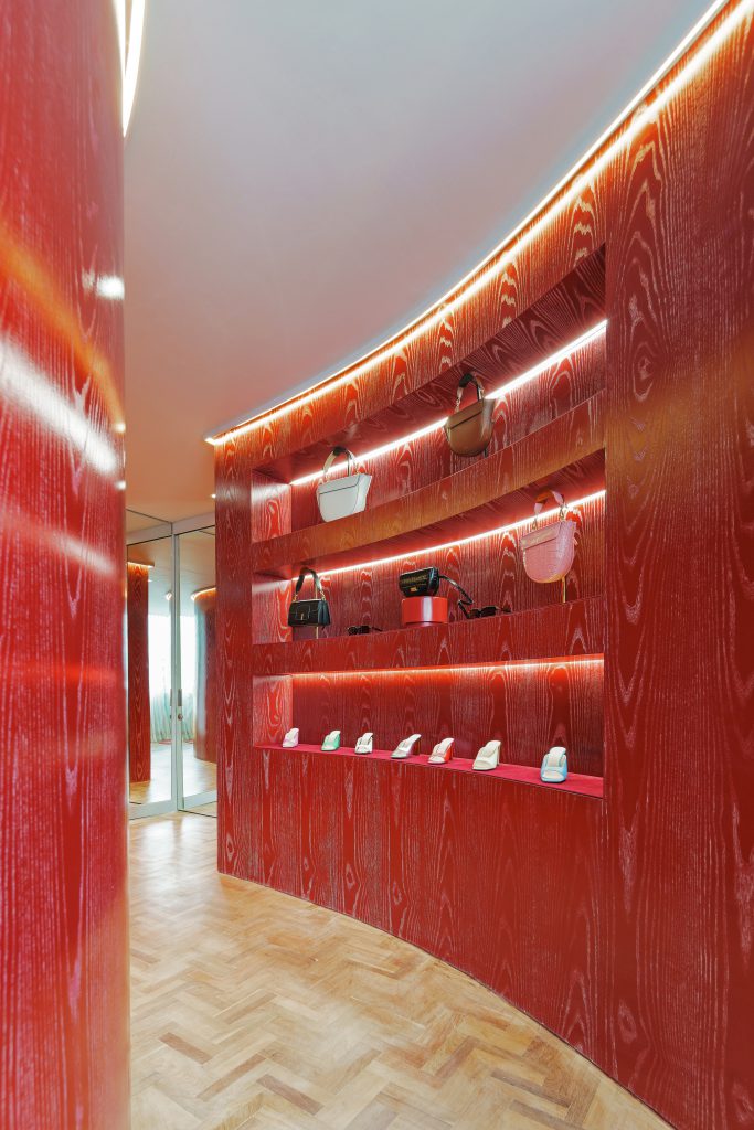
The name BOLD has been graphically arranged in what appears to be an art-deco-inspired style over the entrance door. The building has been divided into three floors, the first for seasonal new arrivals by various fashion designers. The second is for the casual catalog products, which are the brand’s own products, while the third floor contains the office gallery. For the interior, the designer continues to infuse the brand identity into every component of the building, such as the design of brass inlay in the forms of the letters B-O-L-D scattered throughout the floor of the entrance hall. In the display areas, the designer incorporated an assortment of materials, some of which have been emphasized in bright bold red, such as red mirrors, red-tinted glass, redwood veneers, and red carpets. It helps create contrast with the parquet flooring and duly deploys those four letters as the carpet pattern.
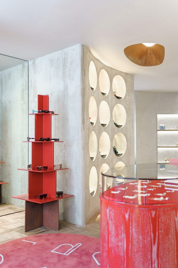
By imbuing the brand identity into every aspect of the building detailing, the design sought to raise brand recognition through the building experience, making use of every inch of space to create a dialogue with the customer to reinforce the brand. Creating multi-dimensional experiences and using a mix of materials and building elements are all part of the endeavor to create a memorable brand experience and are seen by the designer as an attempt to find the balance between the old and the new. The choice of the color red was not only inspired by the corporate identity but was also influenced by color psychology and is employed to create focal points, such as through the openings that let in daylight to illuminate the red color. Additionally, the white ceiling and the grey walls, which contrast with the aluminum shelves, help accentuate the products effectively.
As this is a renovation project, new building elements have been inserted into an existing building fabric, resulting in a variety of architectural expressions. One such is the red-tinted mirrored walls around the stairwell that not only provide the visual illusion of extended space but also color the natural light that comes through from above in the brand’s shade of red. These spaces act as a conversation between self, identity, the old, and the new, similar to how fashion design often borrows from past cultural values and combines them with new ideas and creativity. One of the main goals of the design was to create such spaces, to create experiences that would relate from the online world to the offline for the brand’s customer base. Another is to devise semi-private spaces, which are bound to become an increasingly significant challenge for designers in the future.