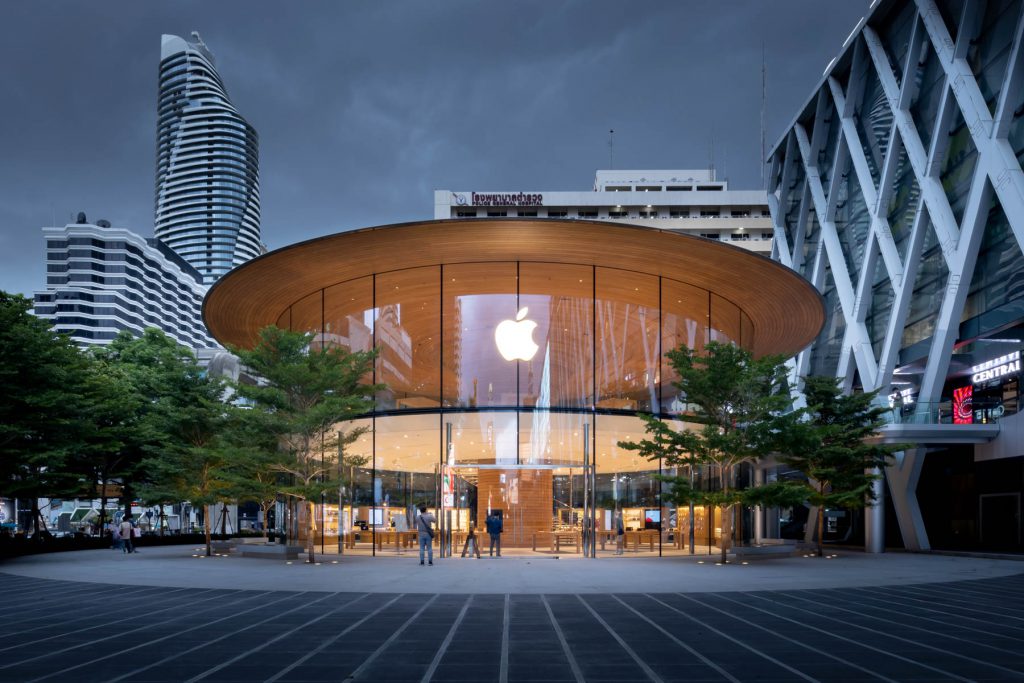
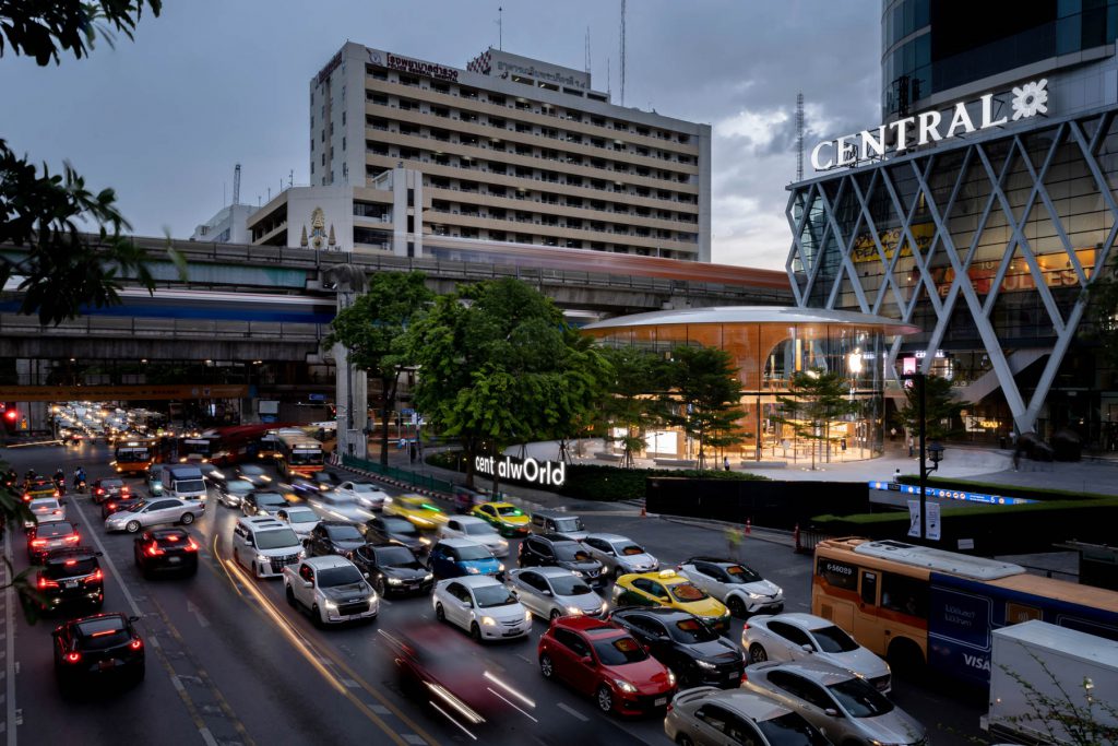
If anyone can remember, the beginning of the 21st Century was the heyday of retail design as one of the most exciting architectural trends that gave birth to many iconic and memorable projects. We were blown away by collaborations between high-end fashion houses and world-renowned architects for their designs of stand-alone flagship stores in big metropolitans around the world, from Tokyo, Seoul, London, and Paris to New York. As for Bangkok, after more than twenty years of waiting since the trend began, the city finally gets to house its own Apple Store by Apple Inc. designed by one of the world’s leading architecture firms, Forster+Partners. The retail space sits on one of the corners of Ratchaprasong Intersection in front of Central World Shopping Mall as Thailand’s first stand-alone structure Apple flagship store.
Text: Kraipol Jayanetra
Photo Courtesy of Foster and Partners Thailand and Ketsiree Wongwan except as noted
Download the online journal Issue 03 Seeing Through Click here
หากจำกันได้ ในช่วงต้นศตวรรษที่ 21 หนึ่งในเทรนด์การออกแบบสถาปัตยกรรมที่ดังในช่วงนั้นคือการออกแบบงาน retail store เราตื่นตาไปกับการที่เห็นแบรนด์เสื้อผ้าไฮเอนด์แห่กันจ้างให้สถาปนิกระดับโลกมาออกแบบร้าน flagship store ในรูปแบบ stand-alone ตามเมืองใหญ่ๆ อย่างโตเกียว โซล ลอนดอน ปารีส และ นิวยอร์ก สำหรับกรุงเทพแล้ว ถึงแม้ว่าเราต้องใช้เวลารอกว่า 20 ปีหลังจากเทรนด์นี้เริ่มมา แต่ในที่สุด เราก็มีร้าน Apple Store ของ Apple Inc. ที่ได้รับการออกแบบโดยบริษัทสถาปนิกชั้นนำระดับโลกอย่าง Foster+Partners มาเปิดเป็นร้าน stand-alone flagship store ตรงสี่แยกราชประสงค์ หน้าลานห้าง CentralWorld เป็นแห่งแรกของเมืองไทย ซึ่งสำหรับสาวก Apple ทั้งในเมืองไทยหรือต่างประเทศ คงถูกอกถูกใจอาคารกระจกโค้งมนเป็นรูปทรงกระบอกที่มีรูปทรงแตกต่างไปจากร้าน Apple Store ในที่อื่นๆ แต่ก็ยังสามารถเก็บรายละเอียดความงามของการเลือกใช้วัสดุ และ การประกอบอาคารได้ตรงตามปรัชญาการออกแบบของ Apple ที่เริ่มเด่นชัดขึ้นมาตั้งแต่ยุค 90s

Photo Courtesy of Foster and Partners Thailand 
Photo Courtesy of Foster and Partners Thailand
อย่างไรก็ดี ด้วยสภาพแวดล้อมของสังคมปัจจุบันที่การเปลี่ยน แปลงของเทคโนโลยีที่เกิดขึ้นอย่างรวดเร็วและบ่อยครั้ง จนทำให้วิถีชีวิตของเรานั้นต่างไปจากช่วงรอยต่อของปลายศตวรรษที่ 20 ต่อต้นศตวรรษที่ 21เป็นอย่างมาก เราจึงมีคำถามว่างานออกแบบสุด high-end อย่าง Apple CentralWorld ยังถือเป็นการออกแบบที่ปรับตัวและนำเสนออัตลักษณ์ของ Appleให้เข้ากับยุคสมัยที่เปลี่ยนไปได้หรือไม่ อย่างที่ทราบกันดีว่าจากผลสำเร็จของการผลิต Apple II (คอมพิวเตอร์ตั้งโต๊ะตัวแรกที่ออกแบบมาสำหรับคนทั่วไป), Macintosh, iMac, MAC OSX, iPod, iPhone, iPad, และ iCloud นั้น Apple มีความเข้าใจและสามารถเลือกที่จะประกอบ พลิกแพลง และ ผลักดันเทคโนโลยีที่มีอยู่ในเวลานั้น ให้เกิดเป็นนวัตกรรมที่มีความแปลกใหม่ในความเกือบจะคุ้นเคย ทำให้ Apple ถูกมองว่าเป็นผู้นำในอุตสาหกรรมเทคโนโลยีสารสนเทศ ที่มีศักยภาพในการกำหนดและเปลี่ยนแปลงวิถีชีวิตของผู้คนมาตลอด 40 กว่าปีของอายุองค์กร
นอกจากอัตลักษณ์ของการเป็นผู้นำในการเปลี่ยนแปลงแล้ว อีกหนึ่งอัตลักษณ์ที่สำคัญของ Apple คือความใส่ใจต่อความรู้สึกและประสบการณ์ของผู้ใช้งาน โดยทาง Apple เน้นการออกแบบระบบที่จัดการความซับซ้อนในการใช้คอมพิวเตอร์ให้ออกมาดูเรียบง่าย ผ่านการเลือกใช้รูปทรงเรขาคณิตพื้นฐานที่คุ้นเคยเข้าใจง่ายมาจัดเรียงองค์ประกอบต่างๆ ผ่านความสัมพันธ์ทางที่ว่าง เพื่อช่วยให้ผู้ใช้งานสามารถใช้สัญชาตญาณในการเดาและเรียนรู้วิธีใช้งานผลิตภัณฑ์ได้ไม่ยาก และ Apple ยังให้ความสำคัญกับลักษณะและรายละเอียดทางกายภาพของวัสดุที่ส่งผลต่อความรู้สึกของผู้ใช้เมื่อได้สัมผัสใช้งาน แนวทางการออกแบบที่เป็นการผสมผสานระหว่างการสร้างความเปลี่ยนแปลง หรือความแปลกใหม่ล้ำสมัย แต่ยังคงรักษาความคุ้นเคยไม่หวือหวา ส่งผลให้ผลิตภัณฑ์ของ Apple ดูคล้ายกับงานออกแบบศิลปะที่ควรค่าแก่การเก็บรักษาดูแลให้มีชีวิตการใช้งานที่ยาวนาน
สำหรับความสัมพันธ์ระหว่าง Apple และสถาปัตยกรรมแล้วนั้น ทาง Apple ถือเป็นบริษัทคอมพิวเตอร์เจ้าแรกเปิดร้านขายสินค้าเป็นของตัวเอง และผลักดันให้เกิดการมองว่าผลิตภัณฑ์ประเภทเครื่องใช้ไฟฟ้า หรือคอมพิวเตอร์เป็นสินค้าไลฟ์สไตล์ มากกว่าที่จะเป็นแค่เครื่องมืออุปกรณ์อำนวยความสะดวกทั่วๆ ไป ซึ่งตั้งแต่ในช่วงแรกๆ ราวๆ ปี 2000-2014 ทาง Apple ได้ใช้บริการของบริษัท Bohlin Cywinkis Jackson ออกแบบ Apple Store ที่เป็นร้าน stand-alone ขนาดเล็กที่อยู่ภายในช็อปปิ้งมอลล์เป็นส่วนใหญ่ จะมีอาคารแนว flagship store ในยุคนั้นบ้าง เช่น Apple Fifth Avenue ที่สร้างอยู่ใต้ลานพลาซ่าหน้าตึก GM ในมหานครนิวยอร์ก อาคารนี้มีจุดเด่นในการออกแบบที่กลายเป็นมาตรฐานในการออกแบบ flagship store อื่นๆ ของ Apple คือ การเอากล่องกระจกทรงลูกบาศก์มาวางบนพื้นที่สาธารณะที่เป็นจุดสำคัญของเมือง เพื่อใช้ทางเชื่อมต่อเข้าไปสู่ร้านของ Apple ที่อยู่ในชั้นใต้ดิน แนวทางการออกแบบของ Apple Fifth Avenue ที่เล่นกับความสัมพันธ์เชื่อมต่อระหว่างพื้นที่สาธารณะกับพื้นที่ส่วนตัว ผ่านการใช้วัสดุที่ให้ความโปร่งใส และให้ความรู้สึกถึงความไร้ขอบเขตผ่านการมองอย่างกระจกใส ซึ่งทำให้ร้านค้านั้นเปลี่ยนสภาพกลายเป็นเวทีให้ผู้ซื้อได้มายืนเปิดเผยให้ผู้ใช้พลาซ่าโดยรอบได้รับชมพวกเขาไม่ต่างไปจากการทำงานของแอปพลิเคชันชื่อดังอย่าง Instagram ที่เกิดขึ้นมาในเวลาที่ไล่เลี่ยกัน ซึ่งจากความสำเร็จในเชิงการตลาดของ Apple Fifth Avenue เราจะเห็นได้ว่าถึงแม้ทาง Apple ได้เปลี่ยนทีมออกแบบมาเป็น Foster+Partners แล้ว แต่แนวทางการออกแบบ flagship store แห่งอื่นก็ยังคงรูปแบบการคิดและวิธีออกแบบของ Apple Fifth Avenue อยู่เสมอขนาด Apple CentralWorld ที่สร้างห่างจากที่ Fifth Avenue อยู่ถึงเกือบ16 ปี ก็ยังคงกลิ่นอายและอัตลักษณ์ที่ไม่ต่างจากเดิมไปเท่าไรนัก
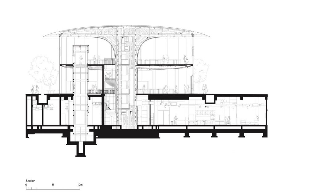
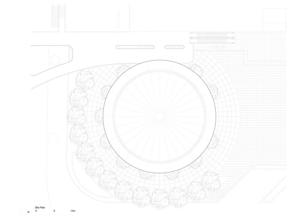
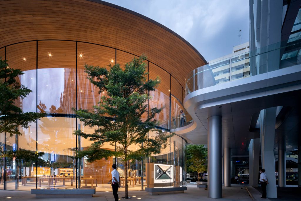
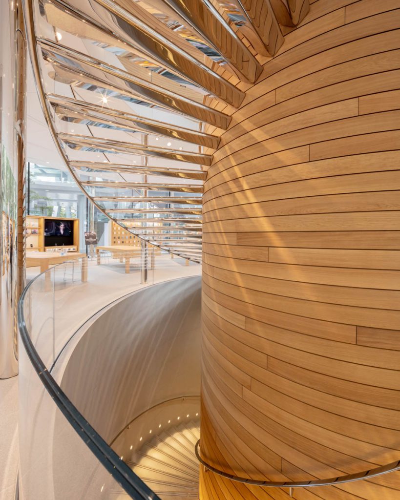
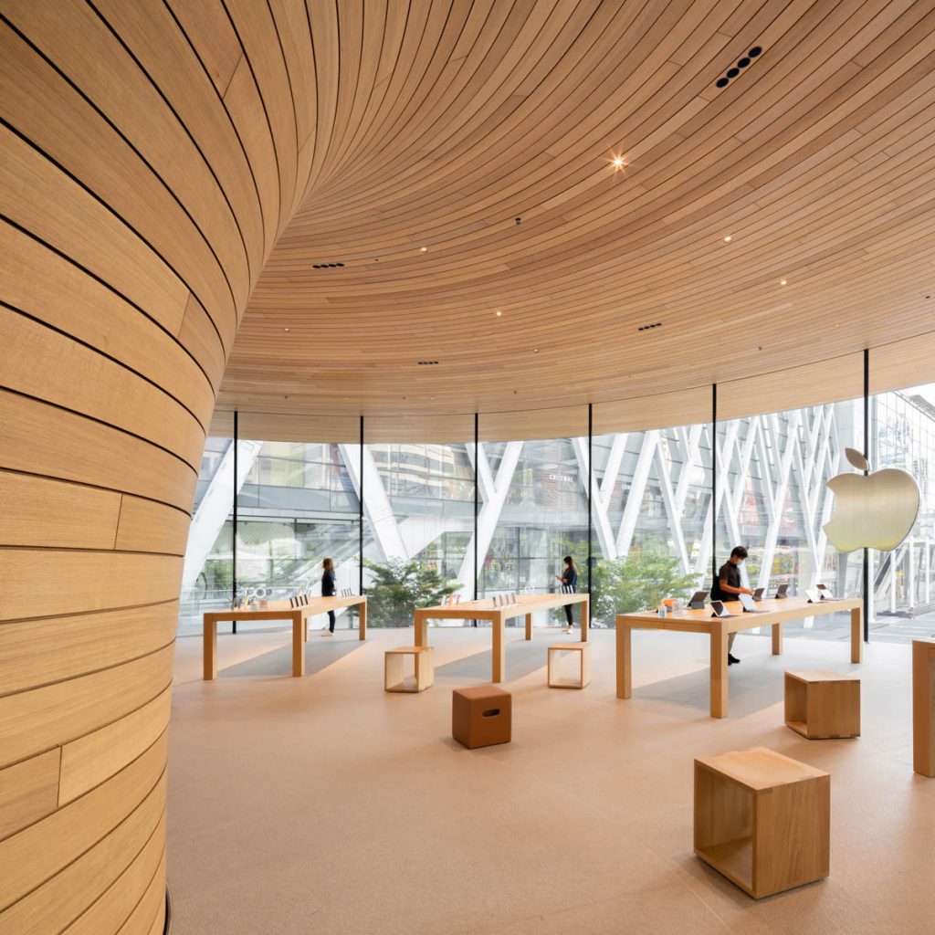
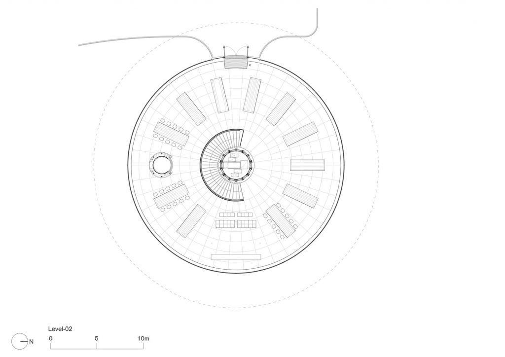
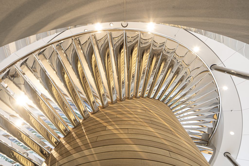
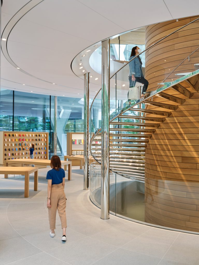
จากที่ตั้งของ Apple CentralWorld ที่อยู่ทางทิศใต้ของลานหน้าห้างสรรพสินค้า CentralWorld ซึ่งหากเรามองให้ที่ตั้งนี้เป็นเวทีการแสดง จะมีลานคนดูขนาดยาวที่วางขนานไปกับถนนราชดำริ และยังมีคนดูที่มองออกลานหน้าศาลพระพรหมที่ตั้งเฉียงทแยงอยู่ตรงด้านหลังของสี่แยกราชประสงค์ ซึ่งทาง Foster+Partners คงเล็งเห็นว่าถ้าหากจะสร้างกล่องกระจกขนาดใหญ่ตรงหัวมุมสี่แยกคงมีความรู้สึกอึดอัด ไม่ลื่นไหล และดูไม่เป็นมิตรกับผู้สัญจรไปมา ดังนั้นเพื่อลดทอนความแน่นของอาคารในพื้นที่สาธารณะ ทางผู้ออกแบบเลือกที่จะใช้อาคารผังวงกลมทรงกระบอกมาแทนที่รูปทรงลูกบาศก์สี่เหลี่ยม เกิดเป็นอัตลักษณ์เฉพาะเจาะจงที่ต่างไปจาก Apple Store แห่งอื่นๆ สำหรับรายละเอียดของ Apple CentralWorld ผู้ออกแบบเลือกที่จะเล่นกับภาพความสัมพันธ์ระหว่างกรอบกระจกโค้งมนทรงกระบอกที่มีขนาดเส้นผ่านศูนย์กลางกว้างถึง 24.4 เมตร และมีความสูงต่อเนื่องจากพื้นชั้นที่หนึ่งไปจนถึงท้องหลังคาในชั้นลอยโดยที่เป็นอิสระจากการรับน้ำหนักอาคารไม่มีส่วนของโครงสร้างคานมาบดบังความรู้สึกบางเบา กับโครงสร้างรูปทรงคล้ายกับแกนลำต้นของต้นไม้ที่แผ่ออกมาเหมือนกิ่งก้าน กลายเป็นแผ่นพื้นชั้นลอยและหลังคาที่คลุมโดยรอบอาคาร

Photo Courtesy of Ketsiree Wongwan except as noted Photo Courtesy of Ketsiree Wongwan except as noted
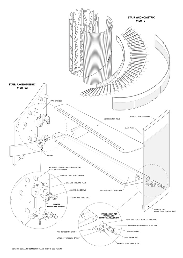
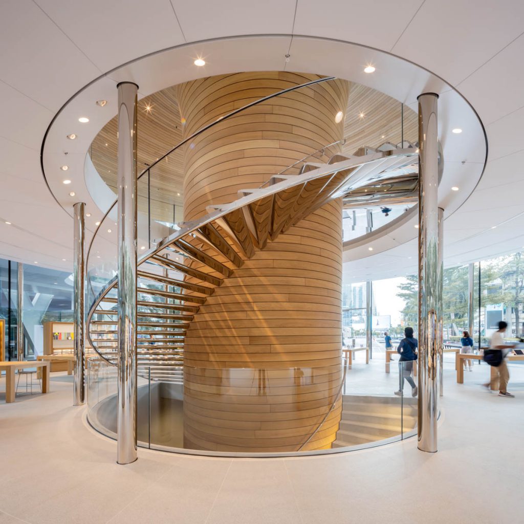
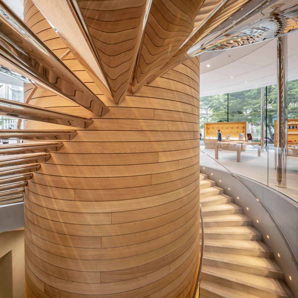
ส่วนรายละเอียดปลีกย่อยที่ช่วยส่งเสริมภาพลักษณ์ เช่น รายละเอียดของการออกแบบหลังคาที่เป็นโครงถักที่มีความโค้งมนลาดเอียง เห็นเป็นภาพปลายเชิงชายที่มีความผอมบางและเบาจนดูเหมือนกับว่าความรู้สึกหนักของหลังคานั้นหายไป หรือความใส่ใจในการออกแบบที่ Apple Store ปรับให้เข้ากับสภาวะอากาศท้องถิ่นด้วยการเลือกที่จะออกแบบให้อาคารแห่งนี้มีชายคายื่นออกมาจากขอบอาคาร 3 เมตรเพื่อตอบสนองการใช้งานในพื้นที่เขตร้อนชื้น หรือการใส่ใจในการจัดเก็บระบบระบายอากาศลงไว้ที่ระดับพื้น ซึ่งถือว่าเป็นเรื่องไม่ค่อยคุ้นเคยกันในการออกแบบในเมืองไทยสักเท่าไร เพื่อเพิ่มความเรียบร้อยในการมองรอบๆ อาคาร และ การเลือกใช้วัสดุราคาแพงอย่างสเตนเลสขัดมัน มากรุเป็นพื้นผิวของลูกนอนบันไดวน ที่วนเกาะอยู่รอบเสาต้นไม้ที่กรุด้วยแผ่นไม้โอ๊ค
หากไม่นับถึงการที่ผู้ออกแบบเลือกใช้เสากลมสเตนเลสวางรับน้ำหนักของพื้นชั้นลอย จนทำให้ความชัดเจนในการชูโรงให้โครงสร้างคล้ายต้นไม้เป็นพระเอกของงานนี้ดูปลอมลงไปหน่อยหนึ่ง เหล่าสาวก Apple ก็คงมีความสุขในการที่ได้ไปใช้งาน เสพสุนทรีย์ของที่ว่างที่ออกแบบตามครรลองของ Apple มาตลอด 30 กว่าปีนี้ อย่างไรก็ดี หากเปรียบเทียบกับการเปลี่ยนแปลงที่เกิดขึ้นบนโลกตลอด 20 ปีของศตวรรษที่ 21 เราได้เปลี่ยนแปลงวิถีชีวิต รวมถึงความเข้าใจต่อความสัมพันธ์ของเราที่มีกับวัตถุต่างๆ ไปจากเดิมมาก ตัวอย่างง่ายๆ เช่นการเข้ามาของการใช้เทคโนโลยี touch screen ที่เปลี่ยนความสัมพันธ์ของมนุษย์จากการใช้เพียงแค่ประสาทสายตามาเป็นการใช้ประสาทสัมผัส หรือการเข้ามาของเทคโนโลยี Cloud ที่ทำให้การไม่มีอยู่ของสสารกลายเป็นความมีอยู่บนโลกที่สำคัญขึ้น หรือแม้กระทั่งความตื่นรู้จากปัญหาในการบริโภคอย่างบ้าคลั่งในสังคมปัจจุบันจนเกิดเป็นกระเเสในการเลือกที่จะใช้วัสดุ recycling หรือ upcycling ในทุกๆ อุตสาหกรรมการผลิต แต่สำหรับคนที่อยากเห็น Apple ทดลองและพัฒนาสิ่งใหม่ๆ ดูเหมือนว่า Apple Store และ Foster+Partners จะสูญเสียการสร้างสมดุลในการออกแบบ ดูเหมือนพวกเขาจะสูญเสียความกล้าในการทดลองและเปลี่ยนแปลง และติดกับอยู่ในวังวนของความสำเร็จจากความคุ้นเคยในอดีตที่เกิดมาจากมุมมองสุนทรียศาสตร์ที่ถูกพัฒนาขึ้นในศตวรรษที่ 20 มันคงเป็นการดีหากในอนาคต Apple กล้าที่จะกลับมาเป็นผู้นำในการเปลี่ยนแปลงโดยใช้งานสถาปัตยกรรมเป็นเครื่องมือในการแสดงออกถึงนิยามใหม่ของคำว่าเรียบง่าย บางเบา หรือโปร่งใส ที่มีความสัมพันธ์กับประเด็นและปัญหาที่เกิดขึ้นจริงในสังคมศตวรรษที่21
For the Apple enthusiasts and followers, both in Thailand and around the world, the curved cylindrical glass walls that set this flagship store apart from other Apple stores is quite exciting to see. Not to mention the details of materials and building components that seem to reflect Apple’s strong design philosophy, which has seen a clear trajectory since the 1990s.
Nevertheless, with the social environment where technological changes take place at a much faster pace and greater consistency, people’s way of life is now starkly different from how it previously was during the turn of the 21st Century. A question arises about whether a high-end design project such as the Apple flagship store at CentralWorld is still considered a successful result of Apple’s attempt to adapt and present its identity in this new milieu.

Photo Courtesy of Ketsiree Wongwan except as noted 
Photo Courtesy of Ketsiree Wongwan except as noted
The world is well aware that the success of Apple II (the first desktop computer designed for personal use), Macintosh, iMac, MAC OS X, iPod, iPhone, iPad, and iCloud are the manifestation of Apple’s understanding and ability to compile, adapt and propel existing technologies at the time into novel yet familiar innovations. These breakthroughs have put Apple in the position of being one of the most influential leaders in the information technology industry. Apple’s influences and potential have helped shape people’s lifestyles throughout the four decades of the brand’s operation. As Apple attains its identity as the leader of changes and innovations, the brand is perceived for its attention to users’ emotions and experiences. Apple has always emphasized on designing operating systems that manage the complexity of computer usage into something simple. Through the relationships between spaces and rudimentary geometric forms, Apple’s products enable users to instinctively guess and learn their features more effortlessly. Apple also focuses on the tactility and impacts of the materials’ physical attributes and details on users’ experiences. The design approach the brand has taken combines technological progress and familiarity, allowing for Apple’s products to possess traits akin to collectible art pieces one uses with care to prolong longevity and keep in the best possible condition.
When it comes to Apple’s relationship with architecture, the brand is the first computer company to ever open its own retail store. This move has shifted consumers’ perception of computers to be regarded as a lifestyle product rather than an electrical appliance or everyday tool. Between 2000 and 2014, Apple hired Bohlin Cywinkis Jackson to design its small stand-alone shops, which were mostly located inside shopping malls. The flagship stores that came out during that particular period include Apple Fifth Avenue at the plaza in front of the GM building in New York City. The building is recognized for its distinctive architecture, which later became the standard for the design of other flagship stores that followed. The design essentially put a cubical glass box in the middle of one of the city’s most monumental public spaces, linking to the walkway that leads into the shop located on the floor underground. The design of Apple Fifth Avenue plays with the connectivity between public and private spaces through the use of transparency that renders a sense of borderless-ness. The transparent glass walls transform the shop into a stage where the shop’s patrons are exposed to people using the plaza. It’s a form of public appearance that works similarly to the way Instagram (which was first launched around the same time) works. Even with Foster+Partners as the new design team, the marketing success of Apple Fifth Avenue serves as a conceptual blueprint for other establishments that ensue, including Apple’s CentralWorld store, which despite being sixteen years apart, still maintains the same quintessential design characteristics.
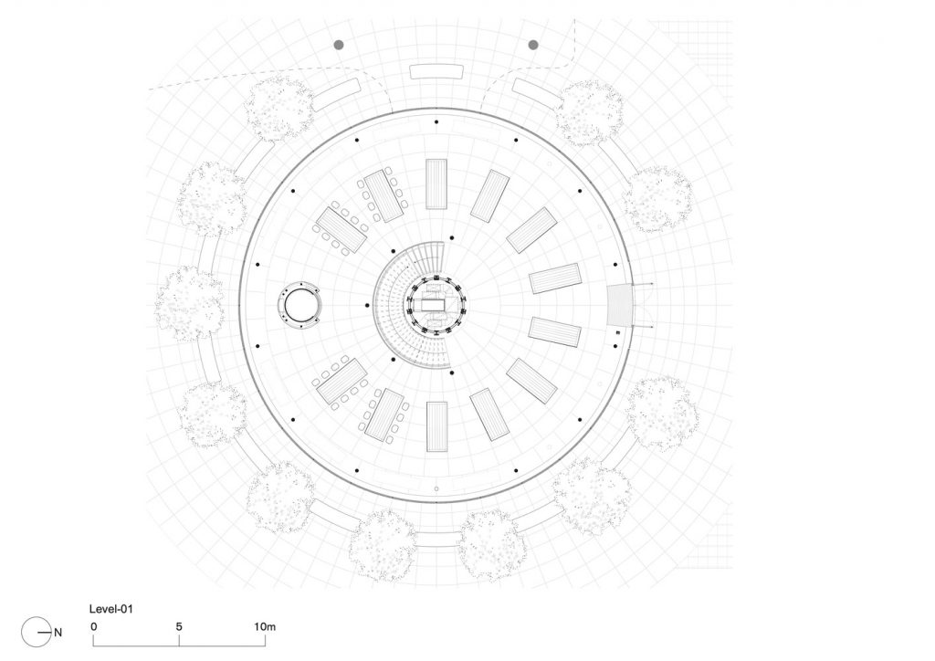
As the shop sits toward the south of the shopping mall’s front ground, one can imagine the location as a stage, which rests in parallel with the expansive public space in front of store’s front and Ratchadamri Road, and diagonally opposite to the Erawan Shrine that occupies a corner of the intersection. Foster+Partners must have realized that placing a massive glass box at the corner of the intersection can disrupt the flow of traffic and pedestrians walking to and from the intersection. To lessen the density of built structures in this highly urbanized area, the design team went with the floor plan with a circular layout, creating a cylindrical architectural form rather than a cubical mass. This unique identity ends up differentiating Bangkok’s Apple Store from other Apple shops. In terms of details, Apple CentralWorld plays with the relationship between the perimeter of the curved glass walls that envelope the space’s circular floor plan with its 24.4-meter diameter size. The floor height runs from the first floor to the ceiling of the mezzanine. The glass frames are built independently from the building’s weight bearing system, hence the absence of beams to obstruct the weightlessness of the transparent mass. The architectural form is similar to a trunk of a tree that spreads its stems into the masses of the floors and roof.
Other miscellaneous details complement the overall appearance of the design, such as the curved truss structure with slender and seemingly light eaves that help take away the weight of the roof visually. The design adapts to the local tropical climate of Bangkok with the use of canopy, which protrudes three meters from the building’s circumference. The ventilation system is installed on the ground floor, a somewhat unorthodox approach to Thailand’s architectural design, but it allows the building’s outer appearance to be more organized. The pricey polished stainless steel clads the surface of the spiral staircase that wraps around the green column covered with oak wood. Apart from the use of stainless steel columns to bear the weight of the mezzanine, which makes the tree-like structure look a little less artificial. Apple enthusiasts can be quite content with this Apple space if they are familiar with designs throughout the three decades of the brand’s history.
Photo Courtesy of Foster and Partners Thailand 
Photo Courtesy of Foster and Partners Thailand
Nevertheless, if we were to compare the changes that have been happening in the world during the past twenty years of the 21st Century, we have gone through and witnessed shifts and transformations in the way people live and have formed a much better understanding in our relationships with objects. One of the obvious examples is touch screen technology that has changed how humans interact from purely a visual sense to include tactility. Meanwhile, the arrival of Cloud technology has substantiated intangible matters into something of great importance. There’s also a collective awakening from the mad excessive consumption in the world today, which has eventually led to the recycling and upcycling trend in practically every industry. But for the people who wish to see Apple experiment and develop something new, it appears that Apple Store and Foster+Partners have lost that balance in the design they created with this particular flagship store in Bangkok. As a result, they have forfeited the chance to be experimental. Instead, they are stuck in the cycle of past success and familiarity with the aesthetics and perspective whose origin dates back to the 20th Century. It would probably be nice if, in the future, Apple will reclaim that leading role of being an innovator and initiator of changes. While also hopefully utilizing architecture as a tool to express its definition of simplicity, weightlessness or transparency that is becoming more relevant to the current scenario and mindset of the 21st Century.