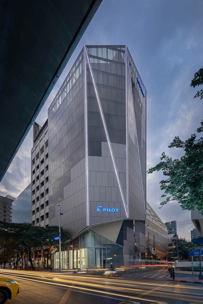
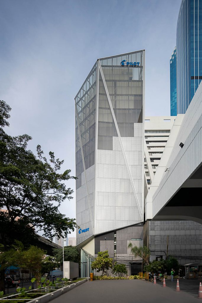
EKAR Architects has refurbished the 43-year old Pilot pen headquarters on Silom Road by reflecting the new brand image through a visually distinctive Façade.
Text: Xaroj Phrawong
Photo: Ketsiree Wongwan and EKAR Architects
Download the online journal Issue 02 More Than Skin Click here
“เริ่มต้นที่กระเบื้องหลุด”
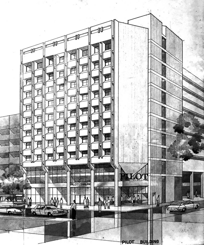
เอกภาพ ดวงแก้ว Design Director จาก EKAR Architects เริ่มเล่าถึงที่มาของการเข้ามาปรับปรุงอาคารสำนักงานใหญ่ของปากกาไพล็อต บนถนนสีลม จากจุดเริ่มต้นที่เรียบง่าย ที่อาคารเดิมแบบยุคโมเดิร์น สร้างเมื่อปีพ.ศ. 2521 ได้ทรุดโทรมลงจนแผ่นกระเบื้องโมเสค วัสดุที่นิยมกรุภายนอกอาคารโมเดิร์นในยุคปลายหรือเลทโมเดิร์น ได้หลุดร่อนลง เป็นสัญญาณให้ทางเจ้าของอาคารเกิดความคิดจะปรับปรุงอาคารใหม่ให้ตอบรับกับยุคสมัย

ภาพบริเวณหน้าอาคาร PILOT
Photo: Ketsiree Wongwan
ภาพอาคาร PILOT ในอดีต
Photo courtesy of EKAR Architects
ไพล็อตเป็นปากกาคุณภาพดีที่เราคุ้นเคยตั้งแต่เป็นนักเรียนในรูปแบบด้ามพลาสติก ประวัติของปากกาไพล็อตเริ่มต้นที่โตเกียว ประเทศญี่ปุ่นในปี ค.ศ. 1918 ยุคไทโช อันเป็นยุคที่ญี่ปุ่นได้พัฒนาหลังจากปรับตัวรับวัฒนธรรมตะวันตกเข้ามาเป็นวัฒนธรรมญี่ปุ่นสมัยใหม่ตั้งแต่ยุคเมจิ บริษัทจำนวนมากในญี่ปุ่นได้เริ่มต้นในช่วงเวลานี้เราจึงสามารถพบบริษัทญี่ปุ่นอายุมากกว่าร้อยปีขึ้นไปที่เป็นผลพวงจากยุคนั้น จากการผสานวัฒนธรรมการเขียนแบบเดิมกับปากกาสมัยใหม่ ได้กลายเป็นการพัฒนาปากกาแบบตะวันตกจนมีชื่อเสียงขึ้นมา สามารถกระจายสินค้าไปได้หลายมุมโลก รวมถึงการเข้ามาประเทศไทยในช่วงหลังสงครามโลกด้วยเช่นกัน แม้ว่าปากกาไพล็อตที่คุ้นเคยจะเป็นแบบที่ผลิตซ้ำจำนวนมาก ขายดี เป็นแบบด้ามพลาสติก แต่จุดเริ่มต้นที่เป็นเอกลักษณ์ของปากกาไพล็อตคือปากกาเกรดดีที่เป็นหมึกซึมปลายโลหะแหลมเป็นสามเหลี่ยม
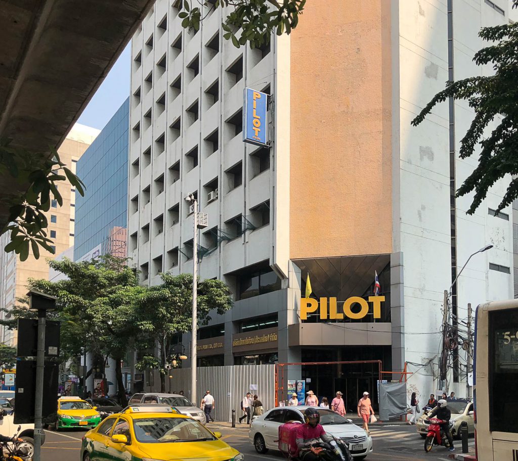
ในอดีต อาคารคอนกรีตย่านสีลม ซึ่งเป็นย่านธุรกิจเก่าของกรุงเทพฯ หลังนี้ ยังมีร้านค้าของปากกาไพล็อต จนเป็นที่นัดพบกันของวัยรุ่น นักเรียนในย่านสีลม ให้มาซื้อเครื่องเขียนใต้สำนักงานปากกาไพล็อตนี้ด้วย จากความคึกคักในอดีตได้กลายมาเป็นความเงียบเหงาในปัจจุบันที่การซื้อเครื่องเขียนในร้านนี้ไม่ได้รับความนิยมมากเหมือนเดิมอีกต่อไป พร้อมๆ กับความทรุดโทรมที่กาลเวลากัดกร่อน ผิวกระเบื้องภายนอกเริ่มหลุดร่อน ทางแบรนด์ไพล็อตจึงได้ตัดสินใจเปลี่ยนภาพลักษณ์ของที่ทำการสาขาใหญ่ประจำประเทศไทยให้ดูทันสมัยขึ้นกว่าเดิมที่เป็นรูปลักษณ์แบบโมเดิร์น จากโจทย์ที่ส่งมาถึงสถาปนิกด้วยงบที่ไม่มากนัก สถาปนิกจึงเลือกใช้วิธีปรับเปลี่ยนแค่ผิวผนังภายนอกเท่าที่งบประมาณจะอำนวย และไม่พยายามแตะโครงสร้างเดิมของอาคารอายุ 43 ปีนี้
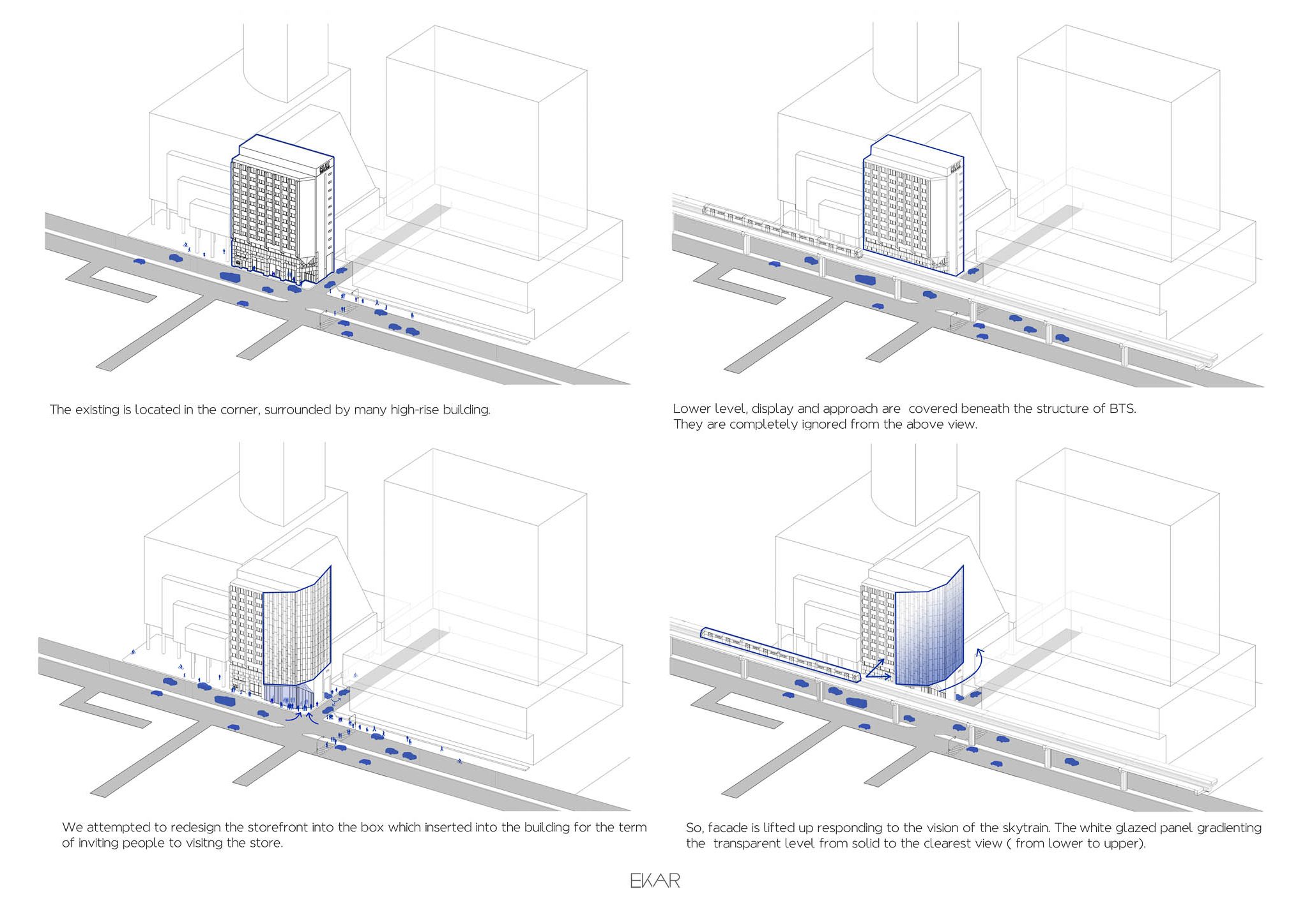
Photo courtesy of EKAR Architects
การออกแบบผิวผนังอาคารจึงเป็นส่วนสำคัญของงานนี้ สถาปนิกได้รับโจทย์ให้ออกแบบกระบวนการก่อสร้างโดยไม่ให้รบกวนภายในส่วนสำนักงานเพื่อให้พนักงานสามารถทำงานได้ตามปรกติ จึงเน้นไปที่ทำการปรับปรุงแต่เปลือกนอกเป็นหลัก แนวคิดในการออกแบบ สถาปนิกได้ใช้วิธีสื่อความหมายที่เห็นได้ชัดเจนสองประเด็น
การสื่อความที่หนึ่ง เรื่องการใช้สอยสถาปนิกออกแบบผิวผนังภายนอกโดยใช้วัสดุ 3 ชนิดเป็นหลัก คือแผ่นเหล็กเจาะรู กระจกใส และสีเทกเจอร์การออกแบบเปลือกใช้วิธีผสานความโปร่งทึบของวัสดุจากการใช้สอยภายใน พื้นที่ใช้สอยอาคารเป็นแนวดิ่งในชั้น 1 เป็นพื้นที่โชว์รูม มีปฏิสัมพันธ์กับผู้คนในระดับถนน การออกแบบจึงใช้กระจกใสบอกถึงกิจกรรมภายในที่เตรียมไว้ให้ผสมกันไปทั้งร้านกาแฟและโชว์รูมปากกา ในพื้นที่ชั้นที่ 2-3 เป็นส่วนพื้นที่สำนักงานของผู้บริหารอยู่ในระดับที่สายตาภายในห้องทำงานปะทะกับรถไฟฟ้าบนถนนสีลมเพื่อป้องกันการรบกวนสายตาจากภายนอกจึงเลือกวัสดุแผ่นเจาะรูวงกลมใหญ่ จากระดับชั้นที่ 4 วัสดุที่กรุเป็นวัสดุแผ่นเจาะรูวงกลมเล็กลงเพื่อสร้างความเป็นส่วนตัวภายใน แต่ลดความอึดอัดด้วยการใช้แผ่นเจาะที่มีความถี่ ทำให้วัสดุมีความเบา ลดความหนักแน่น มีความเบลอมากขึ้นวัสดุกรุผิวส่วนที่เลยชั้นที่ 4 ไปจนสุดด้านบนเป็นกระจกไล่สีจากเข้มไปอ่อนจากล่างขึ้นบน เพื่อให้พื้นที่ทำงานภายในสามารถเชื่อมโยงกับธรรมชาติภายนอกได้ดี ไม่ถูกรบกวนจากการปะทะของแนวรถไฟฟ้า เมื่อมองวิธีการออกแบบด้วยการรับรู้ทางสถาปัตยกรรมแล้วนั้น การเลือกใช้ผิวผนังที่มีความหนักในส่วนฐานจะให้ความรู้สึกหนักแน่น การใช้วัสดุที่ดูเบาขึ้นในส่วนลำตัว และการใช้วัสดุที่ดูเบาที่สุดในส่วนบน จะสร้างการรับรู้ว่าตัวอาคารไกลขึ้น สูงขึ้นจากระยะจริง สำหรับการแบ่งแพทเทิร์นของเปลือกอาคารสถาปนิกเลือกใช้เส้นตั้งตามขนาดวัสดุทั้งกระจก แผ่นโลหะเจาะรู ทำให้สัดส่วนอาคารดูชะลูดขึ้นอีก ซึ่งสามารถช่วยเน้นแนวตั้ง ให้ดูสูงขึ้น ตามวิธีการลวงตาจากการรับรู้ทางสถาปัตยกรรม
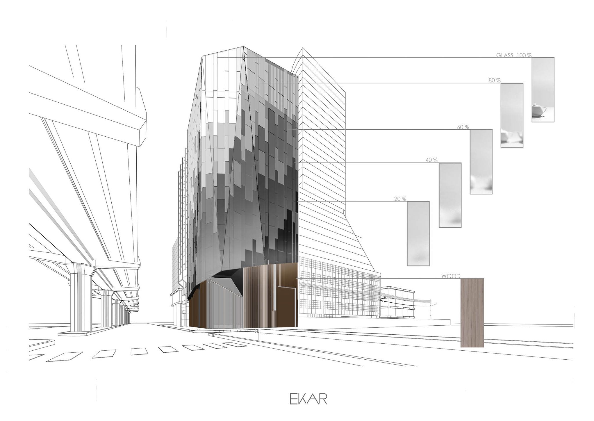
Photo courtesy of EKAR Architects
การสื่อความที่สอง คือการสื่อถึงบุคลิกอาคารจากแบรนด์ เมื่อดูจากความโดดเด่นของอาคาร วัสดุที่เป็นตัวหลักจะให้ความสำคัญของโลหะ กระจกแม้ว่ามีหลายวัสดุที่สถาปนิกเสนอไปแต่ในที่สุดเจ้าของโครงการตกลงเลือกวัสดุให้สะท้อนถึงบุคลิกของผู้บริหารยุคใหม่ ที่ดูทันสมัย สง่าเรียบร้อย การสะท้อนบุคลิกออกมาชวนให้คิดไปถึงการอุปมาอุปมัย (Metaphor) ที่พูดถึงสิ่งหนึ่งด้วยการแทนค่าถึงอีกสิ่งหนึ่ง วัสดุหนึ่ง สเปซหนึ่ง แบบให้มีการตีความ ไม่จำเป็นต้องเป็นการแทนค่าแบบตรงไปตรงมาแบบ Analogy เมื่อย้อนคิดไปถึงปากการุ่นแรกเริ่มที่สร้างชื่อของไพล็อต ซึ่งก็คือปากกาหมึกซึมที่ปลายปากกาเป็นโลหะทรงสามเหลี่ยมความแวววาวของส่วนปลายปากกาโดดเด่นจากวัสดุด้ามปากกาที่นิยมสีเข้ม แบบที่นิยมในยุคนั้น การเลือกใช้แผ่นโลหะมากรุผิวผนังอาคารจึงมีนัยยะให้สื่อถึงบุคลิกของปากการุ่นสะสมของไพล็อต ความแวววาวที่ดูหนัก ถูกขับให้โดดเด่นขึ้นด้วยความเบาของกระจกไล่สีที่มีสีเข้ม ที่เมื่อวัสดุสองชนิดมาปะทะกันจะดูขัดแย้งกัน แต่สัดส่วนและจังหวะ ช่วยทำให้โลหะมีความโดดเด่น
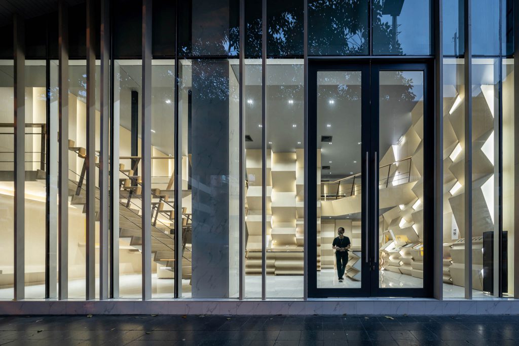
Photo: Ketsiree Wongwan
จากการเข้ามารับหน้าที่ให้ปรับปรุงอาคารเก่านี้ สถาปนิกได้เห็นถึงความจงใจในส่วนของผนังคอนกรีตทาสีเหลืองตรงหัวมุมอาคาร ที่มีลักษณะเป็นสี่เหลี่ยมผืนผ้ายาวจากส่วนยอดลงมาที่ฐานอาคาร จากนั้นจบส่วนปลายด้วยรูปสามเหลี่ยมทิ่มลงสู่ประตูทางเข้าหลัก สถาปนิกได้เลือกที่จะเก็บส่วนนี้ไว้เช่นเดิม แต่หุ้มส่วนสี่เหลี่ยมผืนผ้าด้วยกระจก และโลหะ ส่วนปลายสามเหลี่ยมกรุทับด้วยแผ่น
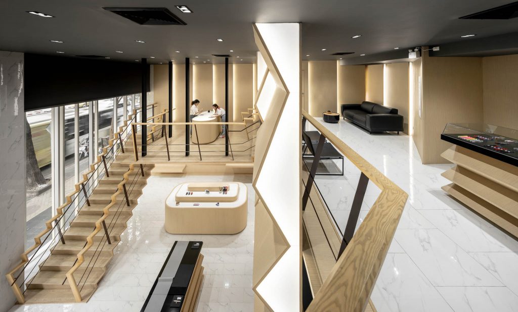
หลังจากสถาปนิกได้ออกแบบเปลือกใหม่ให้กับอาคารนี้แล้ว โจทย์ที่ได้รับต่อมาคือการสร้างโปรแกรมที่เกิดขึ้นใหม่คือส่วนมิวเซียม เริ่มต้นจากการที่เจ้าของโครงการให้โจทย์สถาปนิกไปหากิจกรรมใหม่ให้กับพื้นที่ว่างส่วนนี้จึงเป็นการผสมร้านกาแฟเข้ากับมิวเซียมปากกาไพล็อต ให้ผู้คนได้มาทดลองใช้ เป็นการพัฒนาใช้การพับจากระนาบภายนอกอาคารที่พับ 5 ทบ สู่การพับครั้งต่อไป มาสู่พื้นที่ภายในจนเป็นที่มาของผนังคลื่นซิกแซ็กในที่สุด
เอกภาพบอกถึงแนวคิดของเขาต่อเรื่องของการออกแบบเปลือกอาคารนี้ว่า “เนื้อหาคือการทำสิ่งเดิมให้ดีขึ้นตามเหตุและผลของมัน สำหรับผมแล้ว การทำเปลือกของอาคารคือการออกแบบเสื้อผ้าห่อหุ้มตัวเรา และเราแค่แสดงออกถึงหน้าที่ของเสื้อผ้าเหล่านั้น”

อาคารก่อนการปรับปรุง
Photo courtesy of EKAR Architectsมุมมองจากถนนซอยด้านข้างอาคาร
Photo: Ketsiree Wongwan
“It all started with tiles falling off!”
Ekaphap Duangkaew, the design director of EKAR Architects said of the reason for renovating the Pilot pen headquarters building on Silom Road. The starting point of the renovation project is simple – this modernist architecture, built in 1978, has declined to the point that mosaic tiles – a popular cladding for late modernist architecture in Thailand some decades ago – started to fall off. It is by this signal that the owner came up with the thought of renovation.
Pilot has long been known as a brand of high-quality pens starting in Tokyo in the Japanese Taisho period in 1918. This period saw significant development in the country as a result of opening its doors to the west and adopting Western culture. This led to the birth of what are now many hundred-plus-year-old Japanese companies. The Pilot brand made its name from combining traditional ways of writing utilizing modern pen design and technology influencing the development of western style pens we see today. Their fame and recognition allowed the company to export their products to many parts of the world including Thailand during n the post-WWII period. Although mass-produced plastic pens are often regarded as their best-selling products, it was the high-end fountain pens with triangular-shaped metal on their ends that became the brand’s signature product that they were best recognized for.
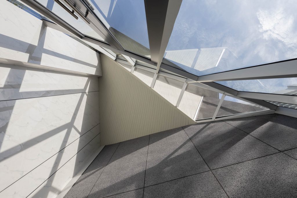
Photo: Ketsiree Wongwan
The old concrete Pilot building, located in the old business district of Silom, also held the brand’s pen shop. It was a popular meeting place for the youth and students who came to purchase pens from the shop. That past liveliness though has become loneliness as its popularity now is not what it once was. As time passed, the building’s condition also declined and tiles on the exterior envelope of the building began to fall off. For this reason, Pilot decided to revamp its brand image to reflect more current contemporary building trends, so its Silom Thailand Headquarters was shifted from a Modernist building into a more contemporary one. With a relatively limited budget for the work, the architect employed for the refurbishment elected to renovate only the exterior skin and leave the original structure of this forty-three-year-old building largely untouched.
Due to the client’s direction that construction was not to impede or interrupt customers and employees, the emphasis of the refurbishment effort was subsequently oriented substantially toward the redesign of the Façades. The selection of materials formed the basis and direction for the design.
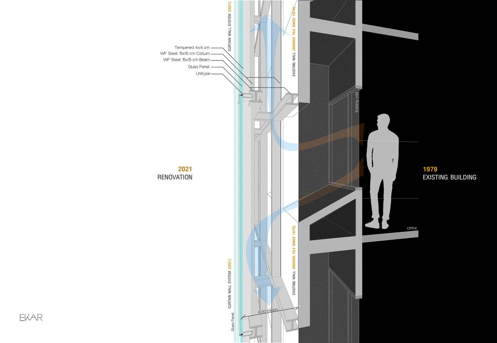
Photo courtesy of EKAR Architects
The architect’s first design concepts were based on utility, choosing materials that included perforated metal plates, clear glass, and textured paints as the main materials for the building’s Façade. The design combines transparency and opaqueness using the qualities of the material in combination. Interior utility spaces are generally vertical, the first floor has a showroom and coffee shop faced in glass shopfront allowing active interaction between these spaces and the people that pass by. The second and third floors house offices for the company executives, views from these rooms are aligned with the Skytrain outside. To minimize potential interruptions to the employees inside, perforated metal screening was installed. The same material is utilized on the fourth floor moreover to create more a sense of privacy. This was achieved by increasing the number of screening penetrations while reducing their diameter.
The Façade from the fifth to top floor is applied with gradient glass whose color gradually tones down between floors allowing visual connection of the interior working spaces with the external environment. The design uses heavier Façade materials at the lower floors providing a perception of sturdiness and a sense of permanence while using lighter-looking materials toward the middle and top of the building making it look taller than it really is. The architect cleverly used these façade materials in a manner that created an illusion of the building’s perception of strength, transparency, depth, and height.
Photo courtesy of EKAR Architects
The second concept applied in the refurbishment was to highlight the brand’s character through the visually distinctive Façade. Although the architect had offered a varied selection of materials to choose from, the client chose materials that reflected the character of the new generation of executives being ‘modern’, ‘elegant’ and ‘sophisticated’. This reflection is a metaphor, indirectly suggesting and interpreting some meaning through something else, like materials and spaces – instead of directly like an analogy. Also, when one thinks of the product that propelled Pilot to fame, what comes to mind is the fountain pen with shaped glistening metal ends wrapped in distinctive then-popular dark-colored material. These elements are reflected in the choice and application of the materials used in the building façade giving it its distinctive unique character.
At the very beginning of the design process, the architect saw that the yellow concrete wall at the building’s corner was deliberately done. This part of the wall is rectangular starting from the top of the building and all the way down to the basement, with the ending being a triangle pointing down to the main entrance. The architect elected to preserve this part, but cover the rectangle part with glass and metal and clad the triangle part with a plate.
Upon completion of the façade, the architect was asked to add a museum as an addition to the building creating a new purpose for the space on the ground floor. The architect subsequently combined the museum space with the coffee shop providing customers a location to test their products within the premises. The design of the space with continuous folding partitions came from the folds in the original façade, so the architect continued that theme internally resulting in the ‘zig-zag’ partitioning.
As to the concept behind the façade design, Ekaphap explained that “The point is to improve the original according to its logic. For me, designing a building’s Façade is akin to designing a cloth that covers our skin, displaying only the utility of those clothes. That’s all.”

พื้นที่ปรับปรุงใหม่ที่โถงชั้นล่างตกแต่งด้วยผนังคลื่นซิกแซ็ก
Photo: Ketsiree Wongwan